


UX Case study: Menu & checkout app for a food truck
Project background
A concept mobile application for a local food truck. The business owners needed an app designed to allow customers to preview their menu, options, and save favorites. Two rounds of usability studies were preformed to get feedback on the app.
The product
A mobile app for a local food truck that allows customers to preview menu items before ordering.
The problem
Design an app for a local food truck to display their menu offerings to attract a wide range of customers.
The goal
Allow as many people as possible the ability to order with confidence and learn more about the food they are eating.
Timeline
May – July 2023
Role
UX Designer
UX Researcher
Visual Designer
Completed project
User research
To understand the user base, empathy maps were created from a series of interviews. The primary user group was determined to be working adults who eat out 1-3 times a week.
This user group affirmed initial assumptions that users of menu apps, and revealed that missing information like allergens, reviews and lack of multi-language support discouraged users.
Process
Empathy map
User personas
Competitive audit
Aggregate empathy map
Pain points
Recommendation
Unclear what items are a must try or ones to avoid on the menu.
Information
Menu not complete with descriptions and photos for items on the menu.
Allergies
Potential allergens and options not clearly labeled on the menu.
User persona

User journey map
Mapping Shelby’s user journey revealed how necessary it is to have accurate descriptions, photos, nutrition information, allergy labels and alternative options for users.
Competitive audit

Señor Sisig / Direct
Mexican Filipino fusion restaurant and food truck in the Bay Area.
Pros
+ Fun and unique branding
+ Wide range of accessibility options
+ Vegan menu offered
Cons
– Menus only offered as PDF’s
– No customization options
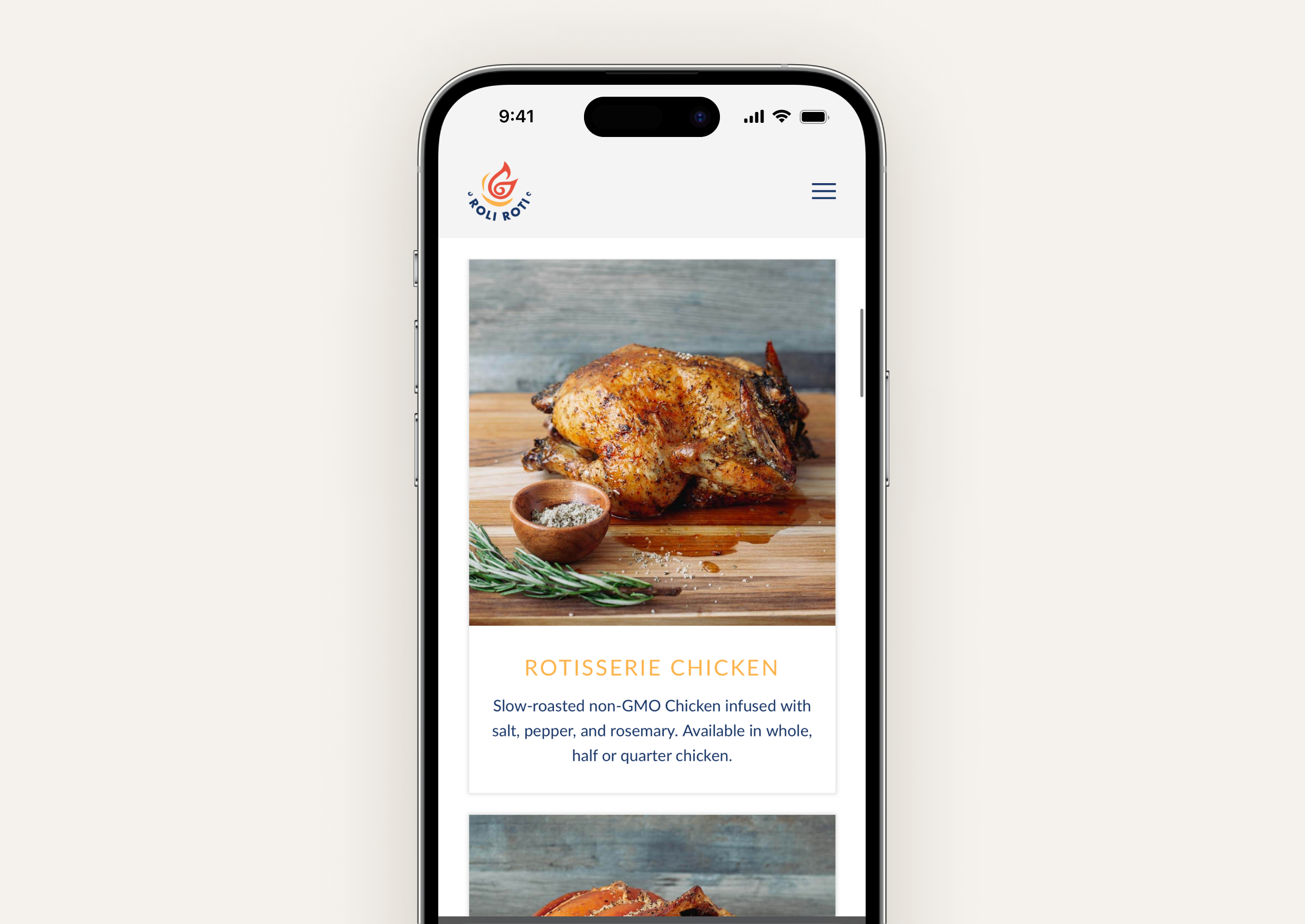
Roli Roti
Food truck that serves various rotisserie meats in the Bay Area.
Pros
+ Recipes offered online
+ Catering and wholesale options
+ Menu available on website
Cons
– Menu lacks information and photos
– No customization options

Sweetgreen
National fast-casual restaurant serving healthy bowls and salads.
Pros
+ Clean and modern branding
+ Easy to use mobile app
+ Icons for every ingredient
Cons
– Customization flow confusing
– Items take up lots of space in the list
Low-fidelity prototype

From the initial research, initial wireframes focused on helping users discover the menu through recommendations. Key information such as photos, descriptions, and allergy tags were also priorities on item pages. Customization and favoriting features was conceived as a way to afford users with dietary preferences a way to order food that would have otherwise been off limits.
Process
Paper wireframes
Digital wireframes
Low fidelity prototype
Usability study
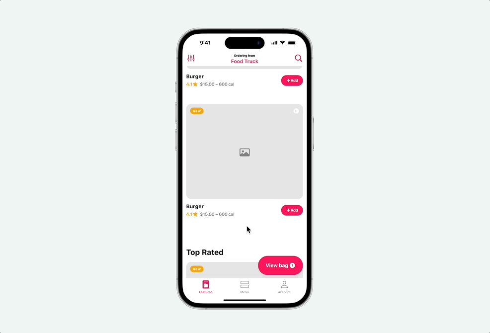
Low-fidelity prototype
Paper wireframes

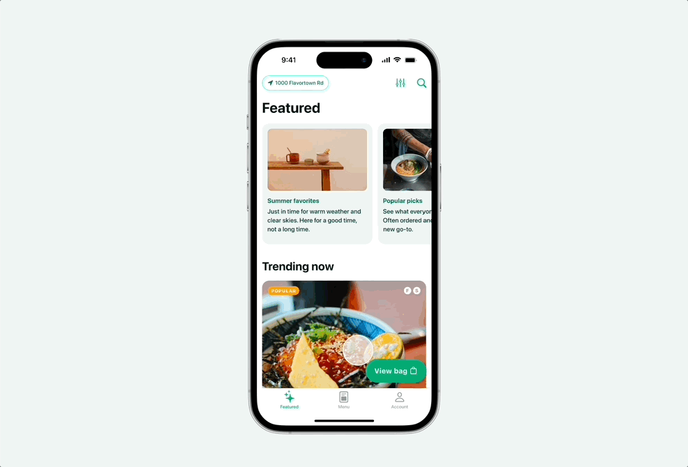
The home-screen (Featured) tab is the main hub for customers. This encourages discovery and highlights new dishes for the food truck. The design incorporates large hero images along with relevant information like star ratings to generate excitement.
Digital wireframes

Featured tab showcases highlights of the menu that users are able to filter through. Reviews are highlighted on each item as well as what items are new to the menu.

Item details surface important information like potential allergen tags, and substitution options. Users are able to read reviews submitted by other users to help support their choice.
Low-fidelity prototype

This initial low fidelity prototype focuses on the Featured tab and customization flow. Additional pages like a list view menu, account, and reviews were created to test how new users would interact with the app.
Usability study
Round 1 findings
80% of users usually make selections based on featured items
Almost all users did not know what ingredients contained allergens
All users expected a checkout feature
Round 2 findings
Users preferred to check out as a guest when given the option to create an account
Users were able to identify and remove ingredients that contained allergens
All users were able to complete checkout. Most were confused how to manage and keep track of their order afterwards
High-fidelity prototype
After two rounds of usability studies, high-fidelity mockups were created. Based on user feedback from Round 1, a checkout flow was created to meet user needs. The ability to create an account was also created to allow users to save favorites, payment options, and review past orders.
After a second round of user testing, the design was further refined. Users noted that they preferred to check out as a guest when given the option to sign up. Most participants were also confused about how to manage their order once checkout was complete. Based on this feedback, a CTA was added to the Account tab after check out to view the submitted order. The pop-over features a stepper to view the status and ETA of the order.
Method
High-fidelity mockup
High-fidelity prototype
High-fidelity prototype
Refinements
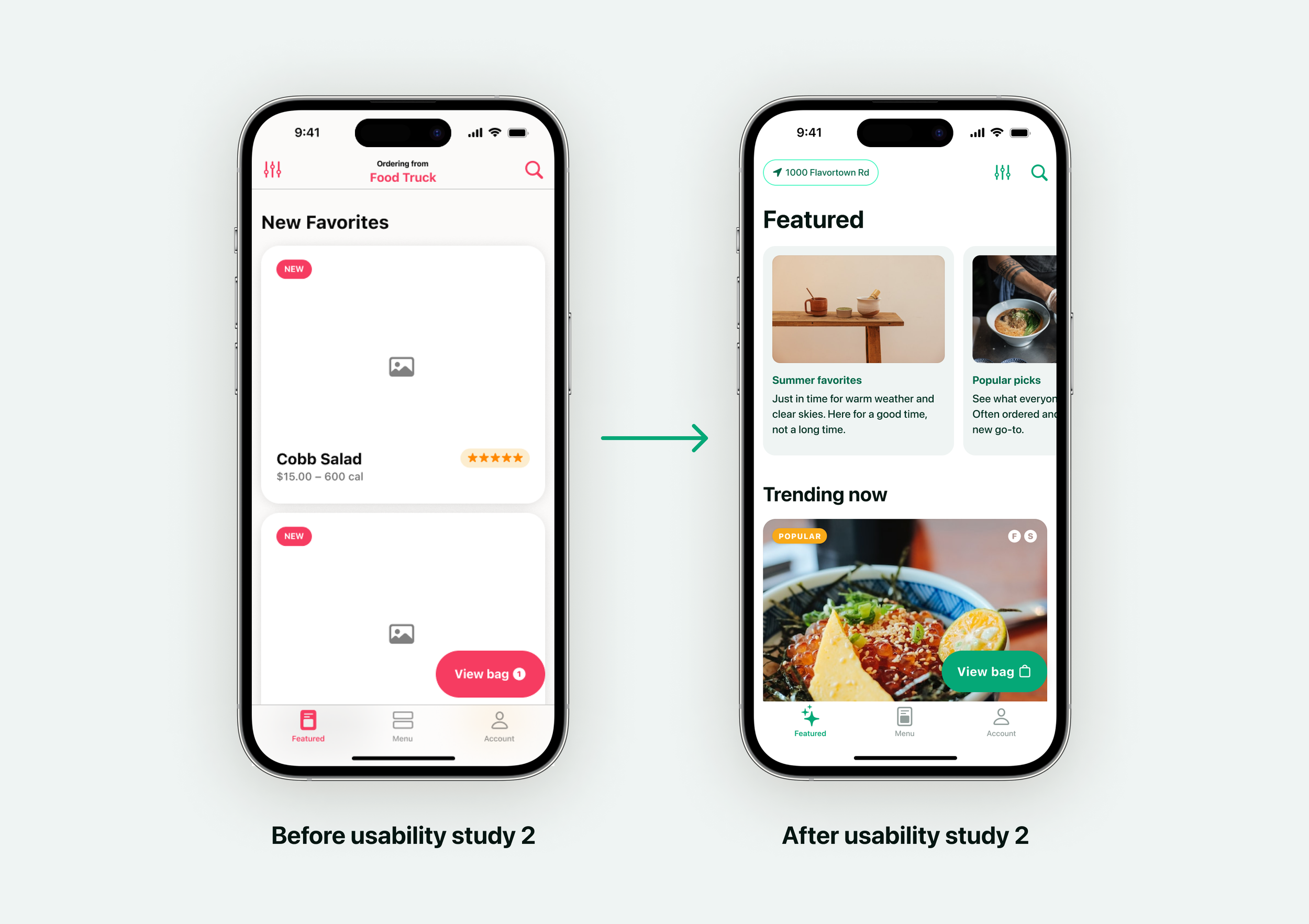
Featured
All participants browsed the Featured tab first. Revisions added more fidelity, categories, and surfaced important allergen labels in line.

Checkout
All participants expressed confusion at the lack of a checkout option. This feature was added in and retested with users - all of whom were able to complete this flow without issue.

Customization
Almost all participants noted that identifying and removing food allergies was a confusing. Allergy tags, identifying icons, and clear selected states allowed all users to clearly understand how to complete this task.
Final product

Based on user feedback, the ability to complete the checkout process from their phone and manage their order was added. This affords potential customers an easy way to preview the menu and place an order, reducing friction in the user journey and leading to higher conversion rates.
The featured tab – users preferred browsing method in user testing – was refined to include curated featured menus at the top, allowing the restaurant to feature a collection of seasonal menu items in one place, or highlight bestsellers. Potential allergy tags were a big focus of our user persona; these are highlighted in list view, and is an integral part of the customization flow.
Highlights
Browse menu
Checkout in app
Customize items
Curated menus
Dietary preference filter
Completed prototype
Onboarding

Sign in/create account
Users can create an account to save their favorite items, dietary preferences, and payment information for quick checkout.
Guest checkout
Users, especially new, have the option to bypass this step. Users may browse and checkout, but won’t be able to see their prior purchases.
Menu

Featured
Curated menus are highlighted at the top of the Featured tab. Trending and new menu items can be found below.
Menu
A list view of all menu items can be found on the Menu tab. New arrivals are featured up top.
Filter
Users can specify dietary restrictions and filter out items that break them.
Customize

Make adjustments
Eligible items can be customized to add or remove ingredients.
Allergy tags
Ingredients are tagged with potential allergens to help users with dietary restrictions make adjustments.
Checkout
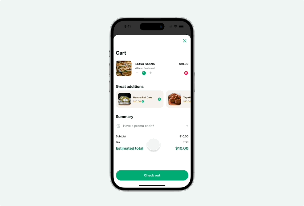
Express checkout
Account holders can easily place an order in a few clicks with saved payment information.
Order status
Users can see a live ETA of their order and track its progress. Users can then mark their arrival for a seamless handoff.
Account
Orders
View previous orders and quickly add them to the cart.
Favorites
Users can save items for later, including any alterations for quick re-ordering.
Takeaways
Impact
This project evolved from a ‘menu app’ to a fully capable mobile ordering system for our food truck. After usability, all users were successful in defining common food allergens, customizing menu items, and placing an order through the app.
Lessons learned
We learned that users have default expectations for dedicated restaurant apps. The value proposition for them is convenience, and saving time for the app to become part of their rotation. A menu alone will not suffice.
Accessibility
Screen reader compatible
Meets HI text size guidelines
Multi-language support
Next steps
Rewards
Building a compelling rewards system to drive conversion and retention
Smart suggestions
Featured content tailored to past purchases and preferences
Wait time estimator
Give users insight on if and when to place a mobile order